10,000 search results
(0.025 seconds)
- Gloriz Vintage by Mans Greback,
$59.00 Gloriz Vintage is the bold and distinctive retro serif font that adds a touch of rustic charm to any project. Designed by Mans Greback in 2023, this font features rounded edges and a heavy, printed appearance that will give your work a vintage look. Perfect for headlines and logotypes, Gloriz Vintage is the perfect choice for designers looking to add a touch of personality to their work. Don’t miss out on this one-of-a-kind family! The Gloriz Vintage family consists of six high-quality fonts: The three weights Regular, Light and Bold, are each provided as both Upright and Italic styles. The font is built with advanced OpenType functionality and has a guaranteed top-notch quality, containing stylistic and contextual alternates, ligatures and more features; all to give you full control and customizability. It has extensive language support, covering all Latin-based languages, from Northern Europe to South Africa, from America to South-East Asia. It contains all characters and symbols you’ll ever need, including all punctuation and numbers.
 - Sierra by Linotype,
$29.99Sierra is an antiqua with a high x-height and generous, open counters. Many curves of the letters are almost right angles, which was particularly suited to the Digiset machines from Dr. Ing. Rudolf Hell, Kiel. The forms of Sierra with their flowing stroke contrast and half serifs have a calligraphic touch, which is especially highlighted in the italic weights. This is a graceful text type and its bold weights look almost like woodcuts. Sierra is an excellent choice for both texts and headlines. - Neospace Exp - Personal use only

- Jotting - Unknown license

- Texicali by FontMesa,
$25.00 Texicali is a multiple weight type design based on our FontMesa logo. The idea was simple: create a sans serif with a few slab serifs added resulting in a style that could feel at home just about anywhere. The regular/standard set works well for general use while the Alt set is perfect for when you want to add a little country charm. The Alt set has a few additional alternate letters built in which are easily accessed using Adobe Creative Suite products such as Illustrator and In Design. The X version, with its higher x-height lowercase, is ideal for signage where you want the look of a lowercase, however your sign still needs to be readable from the street. Larger x-heights also come in handy for web use helping to make the text more readable on smaller devices. The price of font styles are subject to change without notice.
 - CajunQueen - Unknown license

- Sendica by RahagitaType,
$14.00 Sendica delivers a playful and charming script experience. It’s the ideal font for adding a dash of elegance to your next design project.
 - Gathenbury by Viswell,
$14.00 Gathenbury is a playful and fancy script font with a serious vibe. Use it to add an authentic charm to any design project!
 - Printers Pictures JNL by Jeff Levine,
$29.00 Printers Pictures JNL is another volume of vintage letterpress stock cuts, cartoons, embellishments and what-nots for those who enjoy these charming illustrations.
 - Ellen by Lebbad Design,
$29.95 Ellen is a charming elegant serif face. Great for headline display and text use. Many alternates and ligatures are included with this font.
 - Boucle2 by TipografiaRamis,
$39.00 Bouclé.2 – an upgraded edition of Bouclé fonts (2009), with careful refinements to glyph shapes and extension of glyph amounts, which enabled support of more Latin languages. New edition consists of eight styles: Light, Regular, Bold weights for plain and round fonts respectably, plus Regular and Light italics. Typeface is released in OpenType format with some OpenType features.
 - Aniron - Unknown license

- French Fries by Red Rooster Collection,
$60.00 French Fries is a three-weight decorative font family. It was created and produced by Steve Jackaman (ITF) in 2017. French Fries has a casual, lighthearted, playful, hand-lettered look, and is food for the eyes at any size. The family is surprisingly versatile, and might be right at home on menus, packaging, and early education materials.
 - Lovely Morentia by Mercurial,
$19.00 Lovely Morentia is lovely script calligraphy made with a touch of sweet, lovely and charming attraction that adds to the impression of a beautiful and elegant. a charming typeface and So beautiful on invitation like greeting cards, sublimation, wedding invitation, branding materials, business cards, quotes, posters, aheadings, signature, logos, t-shirt, letterhead, signage, lable, news, posters, badges and more What is interesting? Imagine you get a beautiful and very charming font in the design you make. that would be the answer you wanted right now. Lovely Morentia has a script typeface and extra letters that allows you to be more free in designing. Lovely Morentia come as OTF Files, and requires no special software to use or access the alternate letters. You can even use Lovely Morentia in basic writing apps like Word For those with Opentype capable software ( Photoshop CC or any version of Illustrator/ Indesign), Lovely Morentia also comes with Opentype features such as access to all the alternate letters and double letter ligatures. And this Font has given PUA unicode (specially coded fonts). so that all the alternate characters can easily be accessed in full by a craftsman or designer. Don't forget to check out other cool fonts on our store and wait for new fonts.
 - Mule Cargo by Menagerie Type,
$20.00 The Mule is a very special mix – it has a donkey father and horse mother, and they often inherit the best qualities of both. "The mule is an example of hybrid vigor, Charles Darwin wrote: The mule always appears to me a most surprising animal. That a hybrid should possess more reason, memory, obstinacy, social affection, powers of muscular endurance, and length of life, than either of its parents, seems to indicate that art has here outdone nature." They are typically very strong for their size compared to horses and are able to cope with bad weather better than donkeys. Mules rarely become ill and their behavior is Intelligent and sensitive. In the right home, they can make great companions for other equines, and wonderful pets. However, if they are unhandled or not correctly trained, mules have the potential to be dangerous. The inner shapes of Mule Cargo are almost identical between the Regular and the Heavy weight. This shared genom make them very powerful pair and a useful design tool for display purposes.
 - FreeSet by ParaType,
$30.00 The type family in four basic styles was designed in ParaType (ParaGraph) in 1992 by Tagir Safayev. Based on Frutiger, of Mergenthaler Linotype, 1976 by Adrian Frutiger. Frutiger font was originally designed for use on signs at the new Charles de Gaulle Airport at Roissy. The straightforward sans serif shapes are suited well for both text and display setting. Six additional styles were added in 1998-2000. Multilingual versions of 6 styles (Light, Demi and Extrabold) include Armenian alphabet designed by Manvel Shmavonyan in 1997. Two condensed Cyrillic styles (Demi Condensed and Bold Condensed) designed by Manvel Shmavonyan in 2005.
 - Ardina Title by DSType,
$50.00 Ardina was designed for the Portuguese newspaper Jornal de Notícias. Right after the exclusivity period, we decided it was a wonderful addition to our type library, therefore we redesigned it and included an extended set of characters. Ardina is a soft and warm news typeface, with five weights and matching italics, three grades (Display, Title, and Text), and slightly narrow proportions but with a very nice x-height. It’s the right typeface for a serious newspaper that intends to achieve a very contemporary feeling.
 - Ardina Display by DSType,
$50.00 Ardina was designed for the Portuguese newspaper Jornal de Notícias. Right after the exclusivity period, we decided it was a wonderful addition to our type library, therefore we redesigned it and included an extended set of characters. Ardina is a soft and warm news typeface, with five weights and matching italics, three grades (Display, Title, and Text), and slightly narrow proportions but with a very nice x-height. It’s the right typeface for a serious newspaper that intends to achieve a very contemporary feeling.
 - Ardina Text by DSType,
$50.00 Ardina was designed for the Portuguese newspaper Jornal de Notícias. Right after the exclusivity period, we decided it was a wonderful addition to our type library, therefore we redesigned it and included an extended set of characters. Ardina is a soft and warm news typeface, with five weights and matching italics, three grades (Display, Title, and Text), and slightly narrow proportions but with a very nice x-height. It’s the right typeface for a serious newspaper that intends to achieve a very contemporary feeling.
 - A Yummy Apology - Personal use only

- Embossanova by Emboss,
$29.00 Embossanova was initially sketched to be a monospaced typeface but quickly took on a life of its own. It developed serifs and numerous arcs and stroke weights. I wanted it to retain a pre computer/unmathematical feel so there is a slight variation on curved characters and their relationship to the X height.
 - ZT Bros Oskon 90 s by Zelow Type,
$13.00 ZT Bros Oskon 90s is a captivating typographic creation that seamlessly blends the aesthetic charm of the 1990s retro era with a modern touch. With unmatched serif elegance and a unique 90s style, this font offers 72 variations, including sharp Condensed forms, graceful Expanded, and captivating italic styles. Every character in ZT Bros Oskon 90s is meticulously crafted, creating a vintage ambiance that is truly enchanting. Featuring 6 font weights ranging from Extra Light to Bold, this font provides you with the flexibility to create a wide range of striking and memorable designs. Features of ZT Bros Oskon 90s: 72 Unique Variations Aesthetic Retro Vibes from the 1990s Elegant Serif Style Condensed, Expanded, and Italic Forms 6 Font Weights: Extra Light, Light, Regular, Medium, Semi-Bold, Bold Exceptional Creative Versatility ZT Bros Oskon 90s is the perfect choice for graphic design projects, branding, posters, and other promotional materials that require a captivating retro touch. Unleash limitless creativity with this font and infuse a nostalgic 1990s vibe into every one of your creations. ZT Bros Oskon 90s has 6 free styles, you can get them on my GUMROAD I hope you have fun using ZT Bros Oskon 90s. Thanks for using this font ~ Zelowtype
 - Happy Serif - Personal use only

- PetalGlyph - Unknown license

- Happy Sans - Personal use only

- Stay Wild by Epiclinez,
$18.00 Stay Wild is a stylish script font. This smooth handwritten script font can be use for any design projects that require a charming appearance.
 - Biotech by Arendxstudio,
$20.00 Biotech is hand painted typeface with a messy, rough and strong feel, perfectly suited for any design occasions. Get inspired by its bold charm!
 - Earth Days by Letterara,
$12.00 Earth days is a font duo inspired by earth day and features an incredibly fun and cute feel! Get inspired by its childlike charm.
 - Good Thinking by Letterara,
$14.00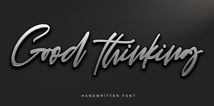 Good Thinking is a beautifully designed handwritten font that’s both authentic and charming. Use it to turn any design project into a true standout!
 - Lux Royale JF by Jukebox Collection,
$32.99 Lux Royale is a stylish script font from Jukebox that is classy and sophisticated. It seems to fit with upscale soirées and a night out with the Rat Pack. The heavier weight and small x-height give Lux Royale a unique look that is both timeless and vintage.
 - Wendy LP by LetterPerfect,
$39.00 The Wendy family is a cursive script provided in three weights -- Light, Medium and Bold. The design is an upright, casual handwriting style, with natural joins and connecting strokes. Wendy, in her various modes, projects a friendly persona, adding an approachable quality to headlines and short runs of text.
 - Hope Sans by Monotype,
$50.99 Hope Sans™ takes the jaunty style of 1950s and 60s lettering and melds it with the jubilant 1970s swashes of Bookman. The result is a sans serif family that is lively, inviting and deeply customizable. Its basic sans serif forms create engaging text, while a roaring collection of swash designs, alternate characters and ligatures make it a natural for attention-grabbing display typography. Hope Sans has been selected by the judges of the 22nd Annual TDC Typeface Design Competition to receive the Certificate of Typographic Excellence. The middle weights of the family are easy on the eyes and shine at smaller sizes and in blocks of text copy. Their friendly vibe also translates well to web and interactive design projects. Spacing is open, counters are large and Hope Sans’ range of six weights can provide just the right design for virtually any need. Headlines, subheads, banners and navigational links are naturals for its lightest and boldest weights – either with, or without, the swash letters. “Hope Sans is a paint box,” says its designer, Charles Nix. “In its basic form, it’s a sturdy grotesque, capable of setting text in a cool and relaxed way. But a bit of accenting with the alternate forms easily creates an entirely different mood and meaning. And for those that are willing to really mix with it, the variety of alternate characters can build truly unique typographic statements.”
 - Woodruff by Greater Albion Typefounders,
$10.00 Woodruff was inspired by a piece of charmingly hand-lettered signwriters’ ornamental Roman seen on a half faded away brick wall, on the end of a row of shops. It has a naive hand drawn charm that lends a very special touch to posters, signage and headings. Woodruff is ideal where an atmosphere of primitive charm, with a little regard for aesthetics is required, and can be used in such situations without sacrificing legibility.
 - Yukura by CONNECRE,
$10.00 Yukura is a charming and approachable sans-serif font that combines cuteness and friendliness. This font features a plump shape that is perfect for designs aimed at children or with a cute aesthetic, and its bold lettering makes it especially suitable for logos and headlines. With its endearing and approachable qualities, Yukura can effortlessly infuse your designs with an irresistible charm. Don't hesitate to incorporate it into your designs and showcase its adorable personality.
 - Silica by Stone Type Foundry,
$49.00 This slab serif is a general purpose type in six weights. The lighter weights are useful for short passages of text. The heavier weights are a versatile tool for setting headlines. Available weights are Extra Light, Light, Regular, Semibold, Bold, Black. Silica was designed to withstand condensation using horizontal scaling without compromising the weighting scheme of the design.
 - Novella by FontHaus,
$19.95 Novella has always been one of Fonthaus' more popular period (Art Nouveau) fonts. The style of Novella captures the essence of typography that was popular at the turn of the 20th century (1890-1905). Its curvilinear lines are organic and floral, complimenting the work of Louis Comfort Tiffany, Charles Rennie Mackintosh and Gustav Klimt among others of the time.
 - ITC Willow by ITC,
$40.99 Willow font was designed by Tony Forster, a fanciful font in the Viennese Secessionist style. The work of Scottish architect Charles Rennie Mackintosh inspired this condensed sans serif typeface with its rough edges and selection of alternate and ligature characters. Willow font revives the look of the arts and crafts of the late 19th and early 20th centuries.
 - Haut Relief NF by Nick's Fonts,
$10.00Based on the typeface Sculpture, designed by Charles Allen in the 1960s for Photolettering, this font is an intriguing exercise in implicit letterforms, using cast shadows to suggest, rather than delineate. Both sublime and subliminal, it’s an excellent choice for commanding headlines. Both versions of the font include 1252 Latin, 1250 CE (with localization for Romanian and Moldovan). - Meatball by Parkinson,
$25.00 Meatball is a fat and happy display font based on some lettering on a mid-20th century poster for the movie Bringing Up Baby. The lettering for the names of the stars, AudryHepburn, Cary Grant and Charles Ruggles, was the basis for Meatball. The sample was all caps and as it evolved, a lower case started to appear, etc.
 - Constellation Pro by Tilde,
$39.75 Constellation started with a simple geometric concept in the manner of Art Deco which gradually developed to a complete typeface, both upright and italic, total of seven weights. The concept allowed the font to be designed from Ultra Light in both very light and quite black styles. This Pro font is packed with all European and Cyrillic alphabets, small caps, variable figure sets and features .


